
From Information Tool to Guide: A Three-Day AI-Native Sprint
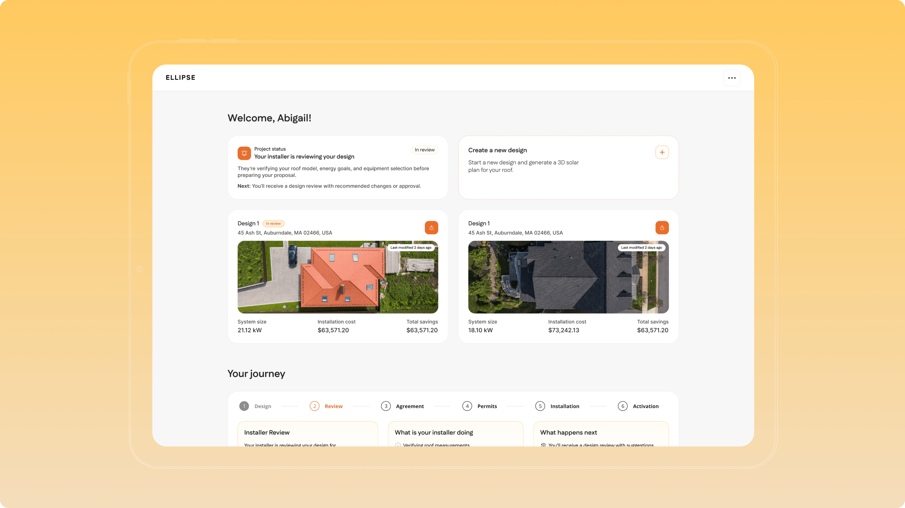
A three-day AI-native design sprint that reframed Ellipse's core problem — and ended with the new direction already designed, prototyped, and validated by the team who owns the product.
- Product strategy
- UX direction
- Product design
- Design sprint facilitation
Overview
Ellipse lets homeowners design their own solar system: model the roof, place panels, see savings, connect with an installer. The product worked. Adoption didn't move the way the team expected.
The assumption going in was that homeowners needed more information — more data, more detail, more accuracy. Three days later, the team had evidence for the opposite.
Key results
The challenge
The problem wasn't information. It was overwhelm. The top-voted homeowner problem statement was “There's too much to take in at once,” followed by “I don't know enough about solar to make decisions” and “I don't understand what these numbers mean or whether I can trust them.” Every winning statement pointed the same way: cognitive overload and low confidence in deciding.
The installer was locked out of the journey. The secondary user had a mirror-image problem — no way to see where a lead sat in their decision process, and no way to guide, nudge, or add value once the customer was in the tool. They were watching from outside while customers decided alone.
The audit confirmed it, screen by screen. The product asked for commitment before earning it — account creation before any trust was built. The design step fired a tutorial, a 3D tool, and notifications simultaneously on load. Results and financing screens were written for professionals, not consumers. The “too much to take in” problem, live in the UI.
Our solution
The opportunities converged on one direction: reduce overwhelm, build trust, and actively guide the homeowner from information to a confident decision. Not more data — the existing experience made easier to absorb, more transparent, and more directive. Model homes became a no-account entry point, so homeowners can explore and learn before committing, and the first screen stops being a gate.
The guiding principle the team landed on in the room: reduce customer anxiety. More confidence in the company and the installer means more likelihood of choosing solar — the throughline connecting the journey, the installer experience, and the business model.
The process
We ran a collaborative sprint with the client's team — not a presentation, not an audit delivered from the outside. Everything below was produced in the room, by the people who own the product.
Day 1 — Understanding the product and setting the foundation
We opened with a product perception exercise to surface how the team actually sees the product versus how it lands, then ran a problem statement activity for both user types: the homeowner as primary user, the installer as secondary. Participants wrote candidate statements and voted. The top-voted problems were reframed as “How Might We” opportunities. We closed by mapping the user journey end to end.
Day 2 — Refining the journey and auditing what exists
We revisited the journey against everything we'd learned, then ran a design audit of the live product — sorting every screen and element into keep, improve, remove. Grounded in the real interface, this turned abstract complaints into screen-level evidence.
Day 3 — Recap and new concept review
We recapped the outcomes, then presented a UX direction built on them — designed and prototyped with AI during the sprint itself. The findings from Days 1 and 2 went straight into high-fidelity screens: the pre-sign-in model home, the sign-up moment, the restructured design panel, the journey tracker. Not wireframes to be interpreted later — real interfaces the team could react to while the reasoning was still fresh.
That's the part that makes a three-day format work: the feedback in that session is what shaped the deliverable.
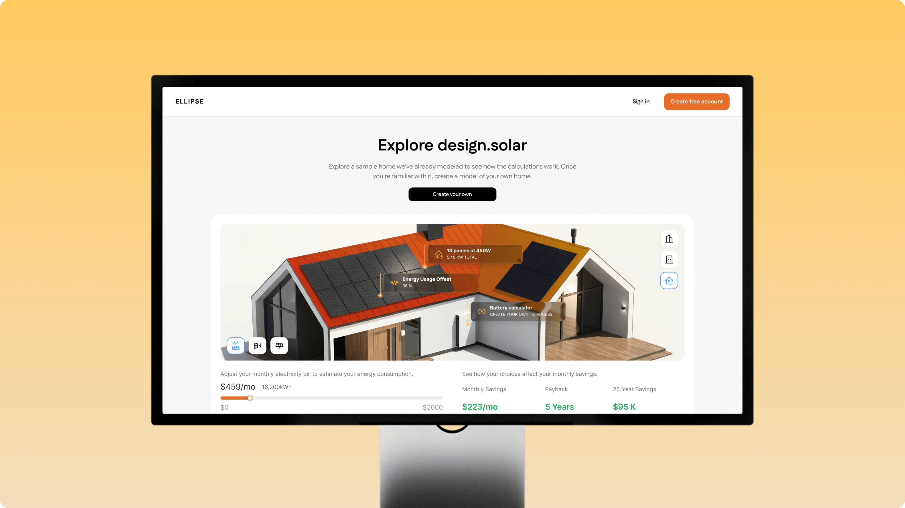
Model homes as a no-account entry point
Homeowners can explore a fully modeled sample home — panels, savings, payback — and learn how the calculations work before creating an account. The first screen stops being a gate and becomes a trust-building moment.
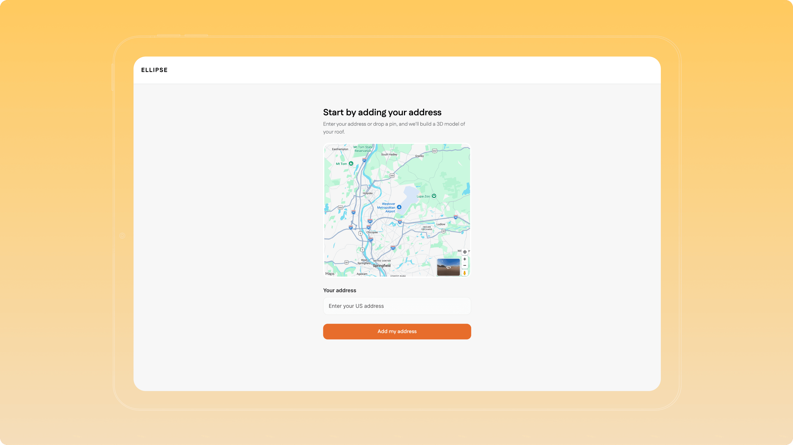
Start with your address
When a homeowner is ready to model their own roof, the journey begins with one simple step: enter an address or drop a pin, and Ellipse builds a 3D model of the roof to design on. One clear action, not a wall of options.
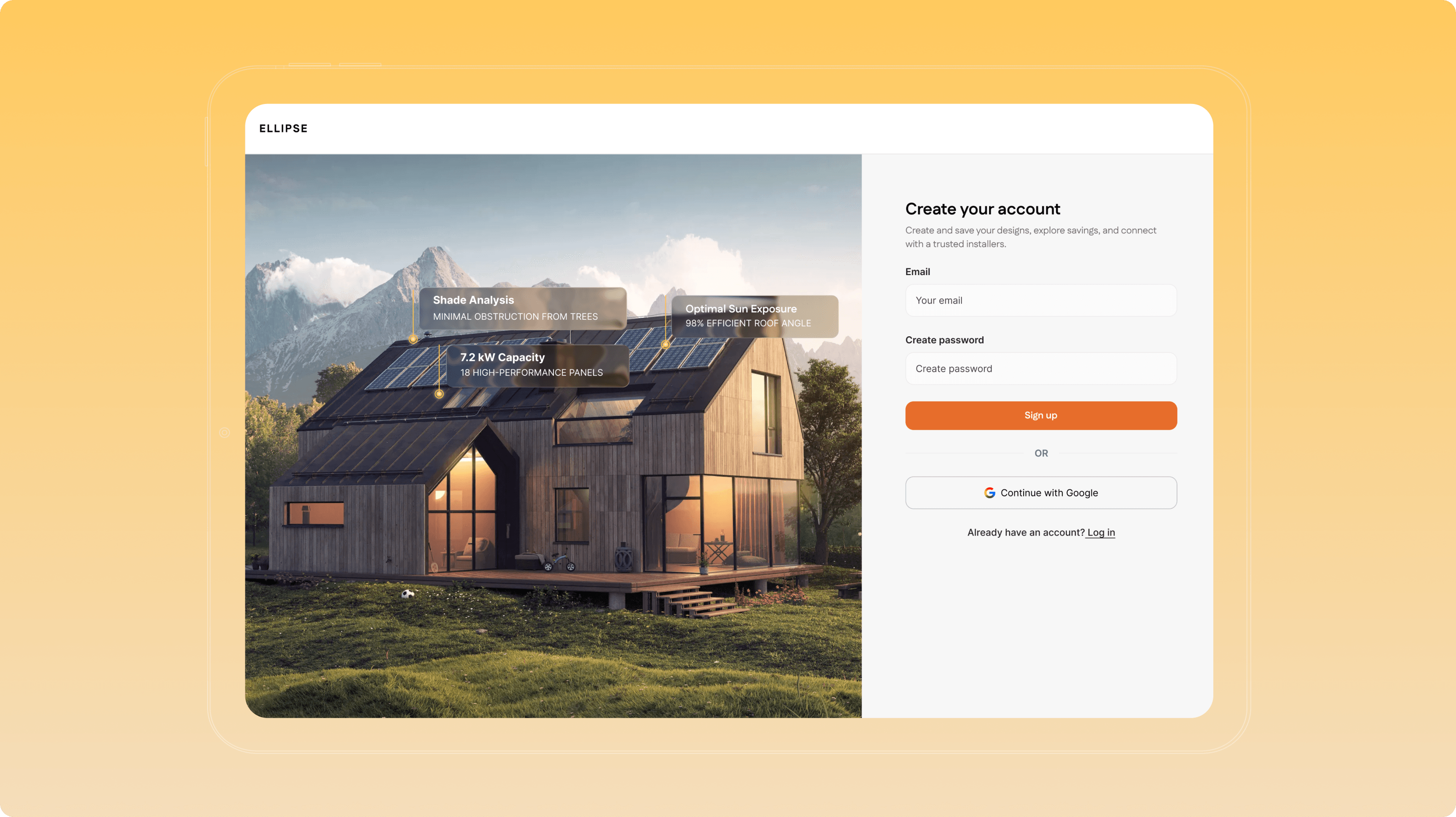
A sign-up that shows the payoff first
Users see what they'll get before filling anything in, then move straight into the map — no dead end between committing and starting. Account creation stops being a gate and becomes a moment of momentum.
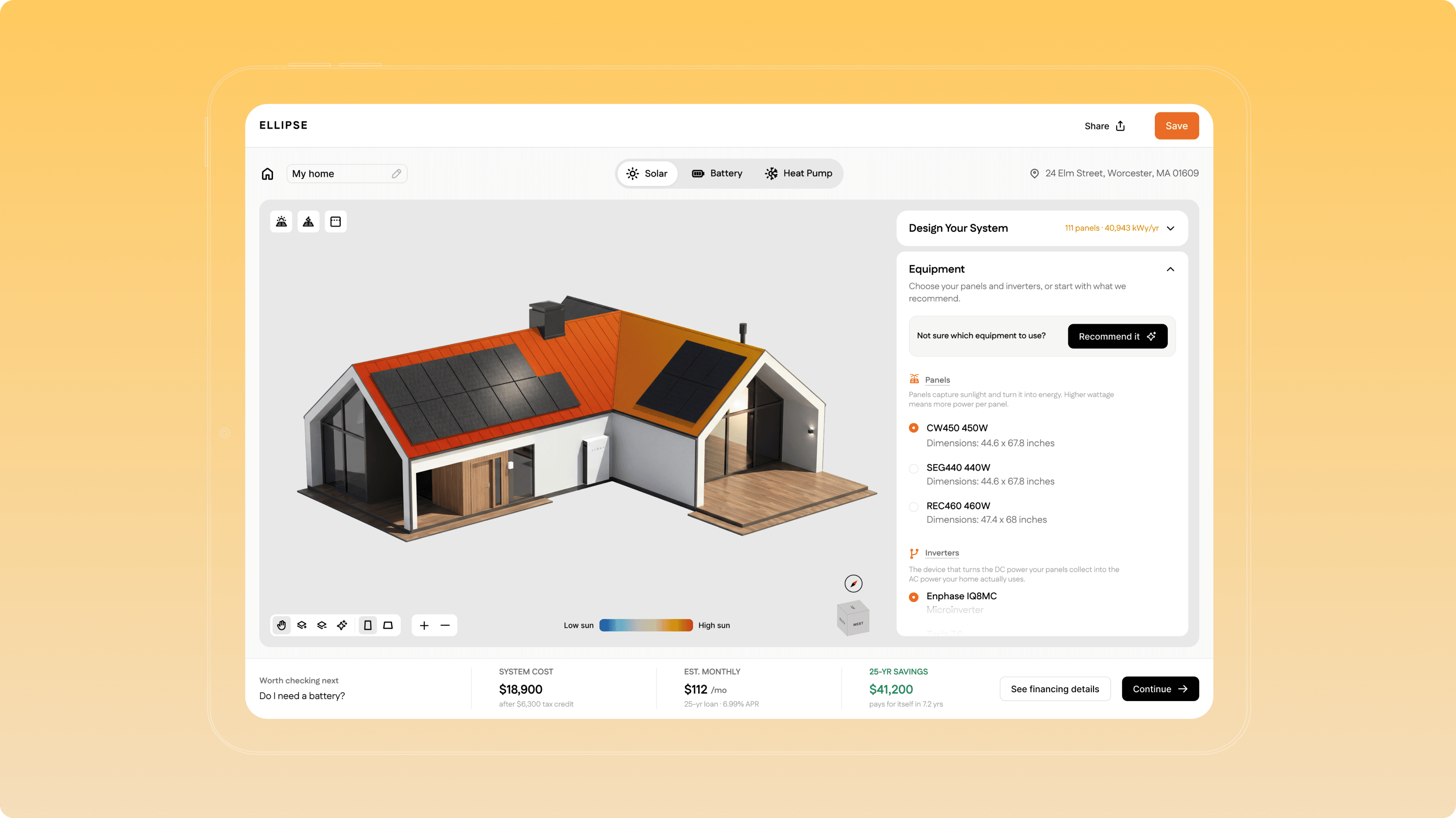
Structure that guides
Modes moved to tabs, related actions grouped, and a persistent bar keeps cost, savings, and financing always in view — plus a “worth checking next” prompt that tells users what to consider, not just what they've built.
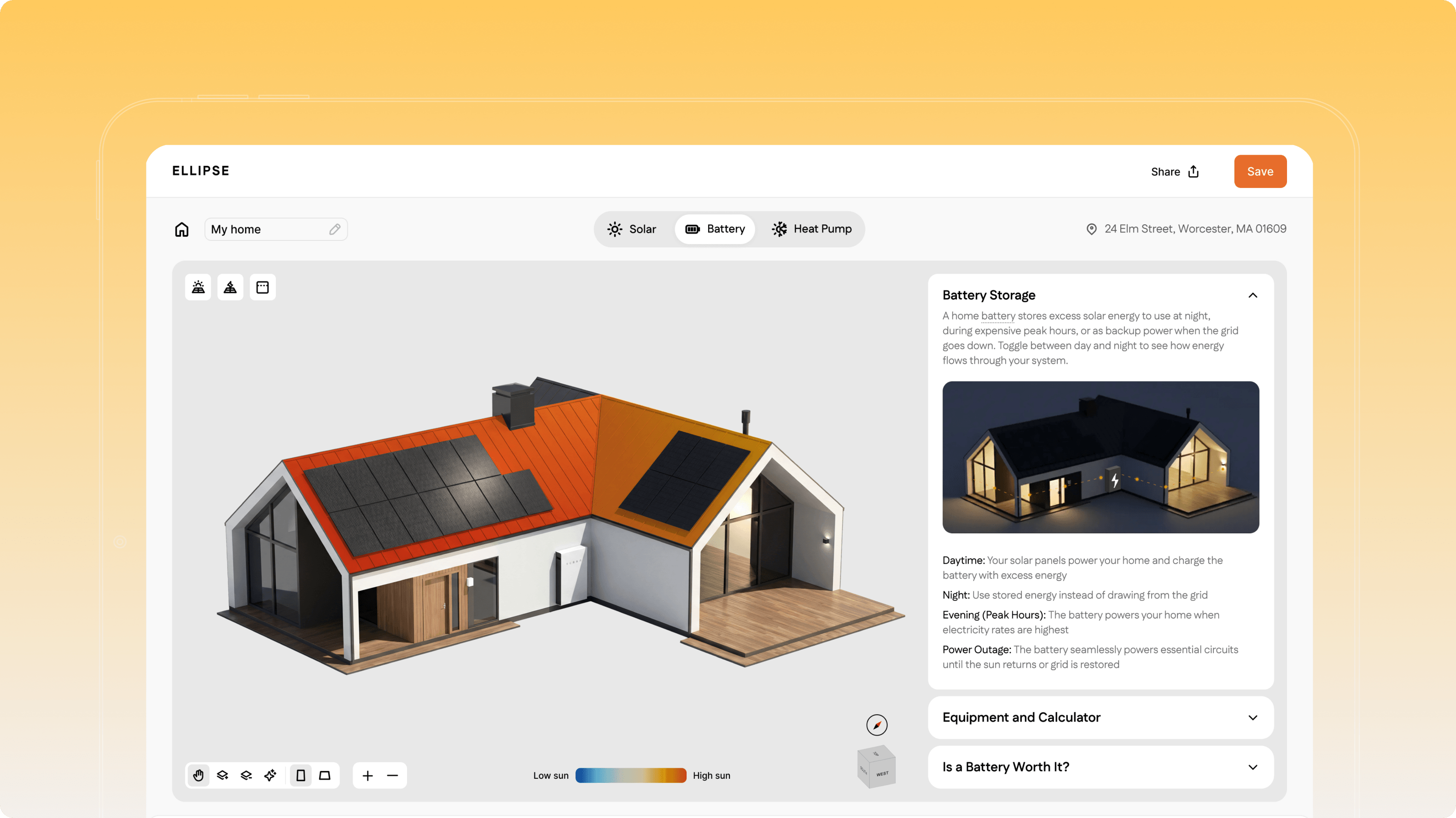
The battery, reframed as a decision
The battery moved from a spec buried in a list to a guided decision tool built around real outcomes — daytime, night, peak hours, and outages — so homeowners can judge whether it's worth it for them, not just what it costs.
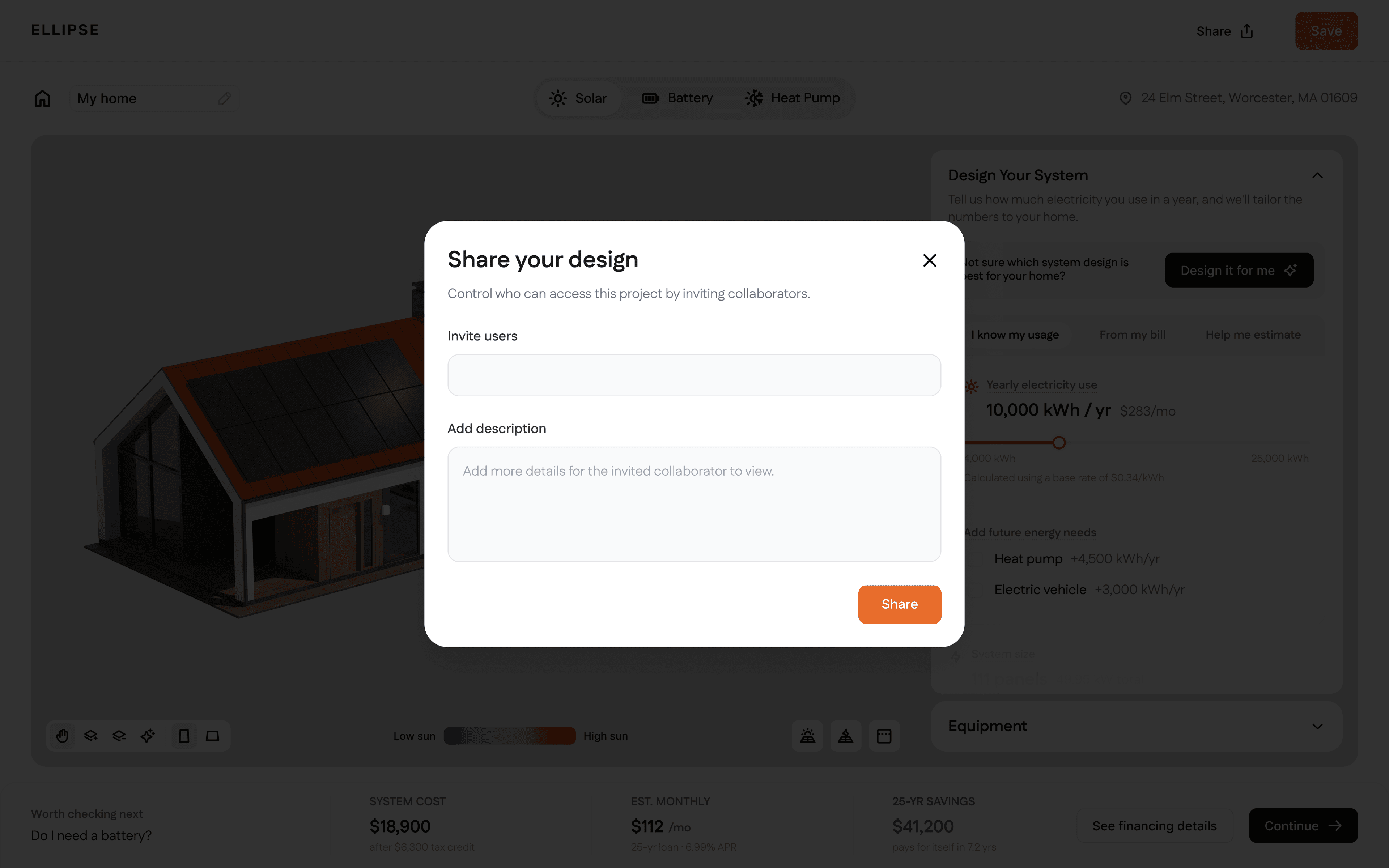
In-platform sharing
A finished design becomes something to hand off and act on, not a file that sits there. Installer collaboration stays in-platform across every sharing scenario, keeping the homeowner and their installer on the same page.
Results
In three days, Ellipse went from “we need to explain solar better” to an evidenced product direction rendered as working screens — with the team's own fingerprints on every decision. A validated problem. An agreed long-term vision. A six-week roadmap of changes the team can start on immediately.
Long term, Ellipse becomes the place where homeowners go from curious to confident, and where good installers win the business they deserve.
Traditional sprints end with sketches and a research summary, and the client then waits weeks to see what any of it looks like. We prototyped inside the sprint — every direction existed as a designed screen before the room emptied — so the team validated the direction against something concrete rather than against a description of it. The AI-native workflow isn't a faster way to draw. It's what collapses the gap between deciding something and seeing whether it holds up.